
Overview
Overview
Master of Science
Library and Information Science, 2010
Syracuse University
Bachelor of Behavioral Science, Cum Laude, 2005
Hardin-Simmons University
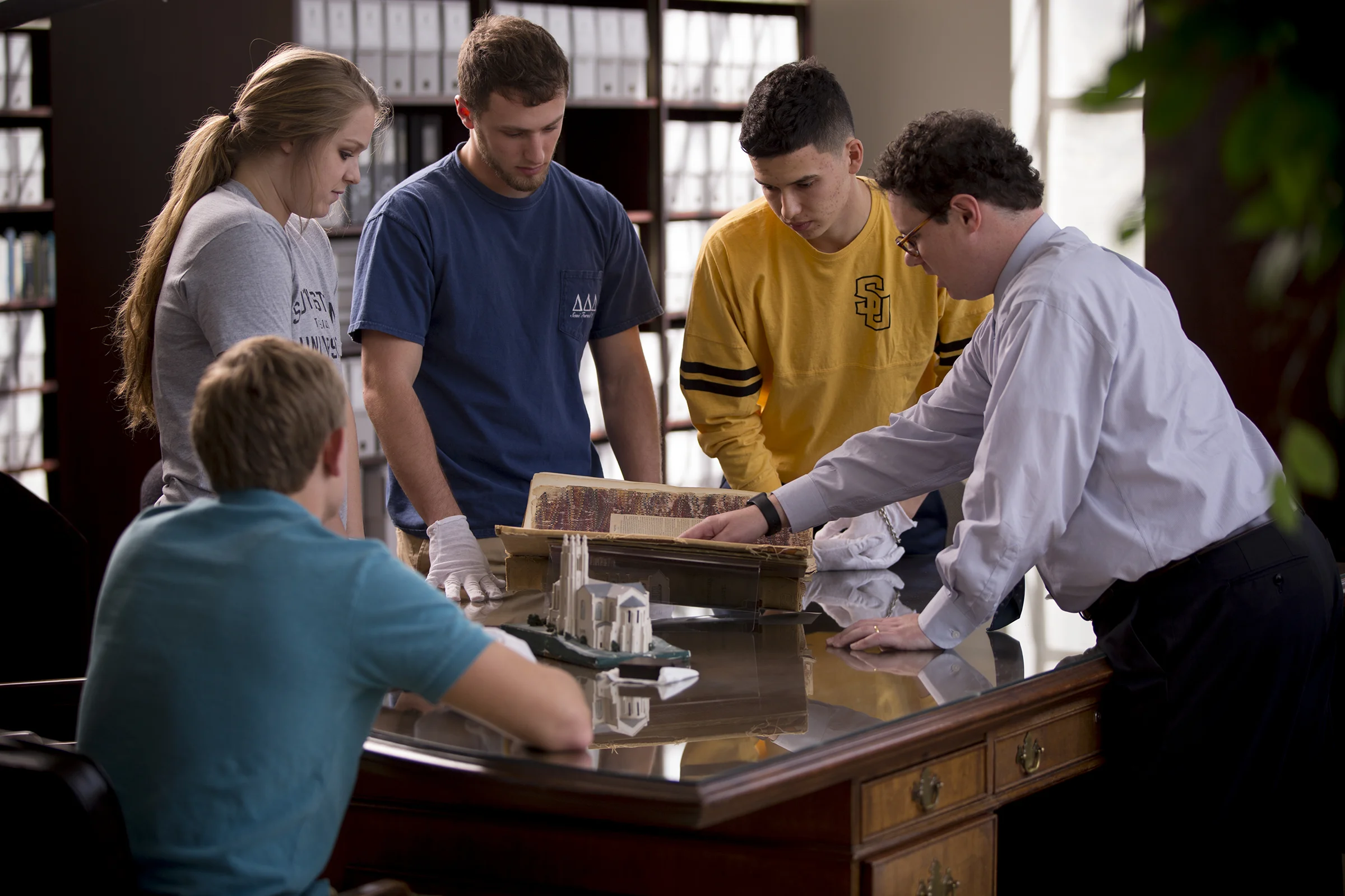
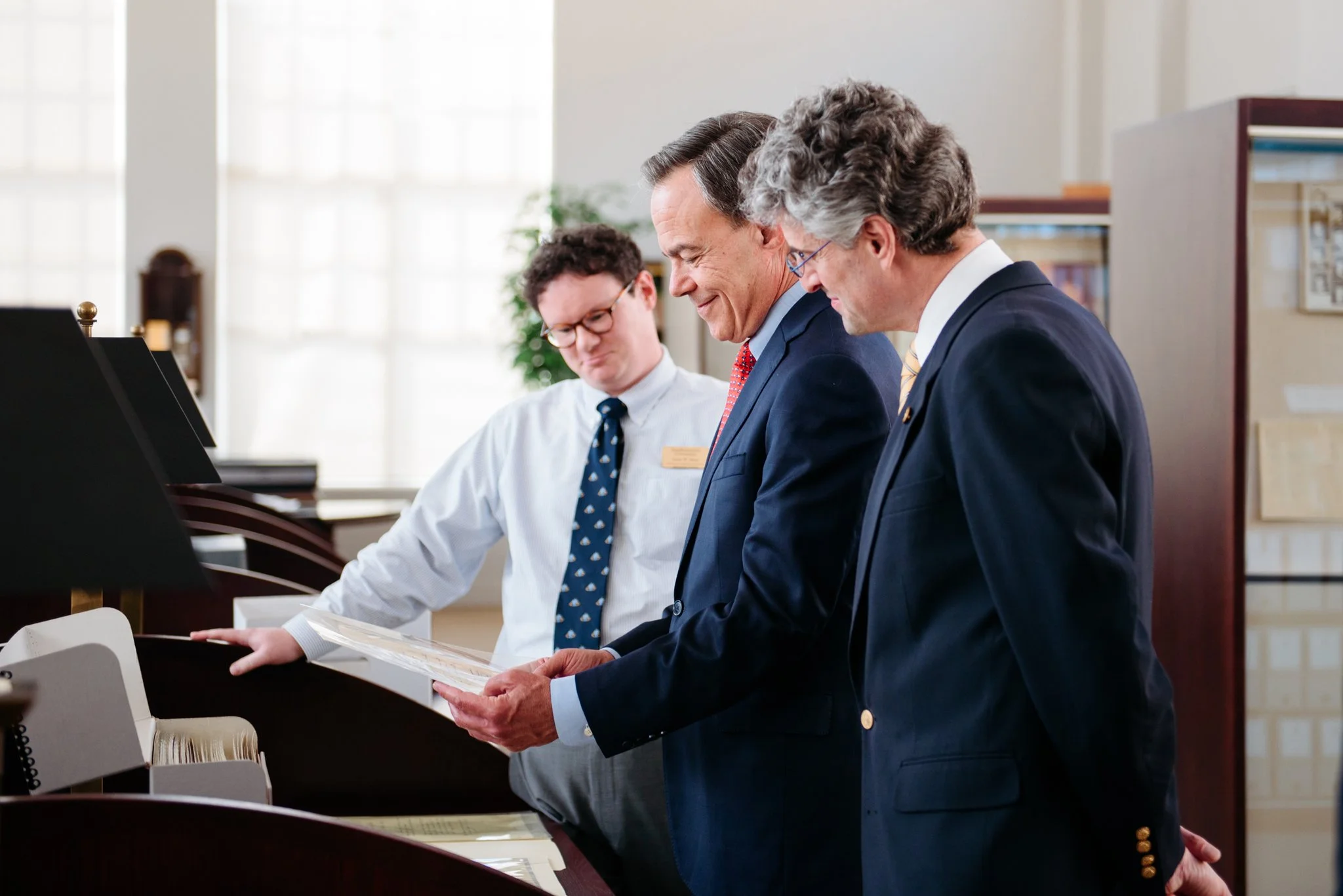
Jason W. Dean is Vice President for Collections and Public Services at the Linda Hall Library, the world’s foremost independent research library devoted to science, engineering, and technology. His undergraduate degree in history is from Hardin-Simmons University, and his MS LIS is from Syracuse University. Jason has also completed coursework at Rare Book School at the University of Virginia.
Prior to coming to Linda Hall Library, Jason was Director of Special Collections & Archives at Southwestern University. He has previously held positions at the University of Arkansas and Crystal Bridges Museum of American Art.
His areas of research interest include special collections administration, American color printing, the work of Carl Hertzog, the life and work of S. Fred Prince, and metadata for rare books and special collections.
Jason is a member of the Grolier Club, and a past IMLS-RBS fellow. He is active in several professional organizations related to history, rare books, and archives.
Employment
Employment
Employment
Vice President for Collections and Public Services
Linda Hall Library
2023-
Vice President for Special Collections
Linda Hall Library
2018-2023
2015-2018
Director of Special Collections & Archives
Southwestern University
2013-2015
Assistant Librarian
Head, Special Formats Cataloging Unit
University of Arkansas Libraries
2011-2013
Cataloger & Technical Services Librarian
Crystal Bridges Museum of American Art
2008-2010
Library Volunteer
Amon Carter Museum of American Art
Scholar
Scholar
Scholar
Selected Honors and awards
Carl Coke Rister Endowed Scholarship in History, Hardin-Simmons University, 2003
Rupert N. Richardson Scholarship in History, Hardin-Simmons University, 2004
Institute of Museum and Library Services-Rare Book School Fellow, 2015
Team Project Award, University of Arkansas Libraries, 2015
Researcher in Residence, Oak Spring Garden Foundation, 2020
Publications
“In Living Color: Crystal Bridges and its American Color Plate Book Collection," Art Documentation: Journal of the Art Libraries Society of North America 32 (Spring 2013): 87-101.
Review of Everything Sings: Maps for a Narrative Atlas, Second Revised Edition by Denis Wood. Library Journal 15 June 2013. Print and Online.
“Charles A. Cutter and Edward Tufte: Coming to a Library Near You, via BIBFRAME,” In the Library with the Lead Pipe, December 4, 2013.
Review of The Engraving Trade in Early Cincinnati by Donald C. O'Brien. RBM: A Journal of Rare Books, Manuscripts, and Cultural Heritage 15 (2): 157-158.
"A Process for Original Cataloging of Theses and Dissertations," Cataloging & Classification Quarterly 53 (2): 234-246. Written with Mary A. Gibertson and Cedar Middleton, University of Arkansas Libraries.
“In a Still, Small Voice, or Listening to the Voices in Special Collections,” Archive Journal, 5 (Fall 2015).
"Social Media as Entrée into Special Collections Reference Works," by Jason W. Dean and Emily Grover, RBM: A Journal of Rare Books, Manuscripts, and Cultural Heritage 18 (1): 37-43.
“The Manuscript Works of S. Fred Prince,” by Sarah Burke Cahalan and Jason W. Dean Archives of Natural History, 45 (1):122-133.
“S. Fred Prince (1857-1949): 'Artist-Scientist' of the Ozarks,” Sarah Burke Cahalan and Jason W. Dean; Book chapter in Living Ozarks: the Ecology and Culture of a Natural Place, Editors: William B. Edgar, Rachel M. Besara, James S. Baumlin; The Ozarks Studies Institute of Missouri State University, 2018.
“Principles of Principia: Some Notes on the Print Run for the First Edition,” by Jason W. Dean and Jamie E. Cumby, The Book Collector 70 (3): 418-435.
“Beyond the Honeyman Sale,” by Jason W. Dean and Jamie E. Cumby, Fine Books and Collections Winter 2022.
“Assaying Il Saggiatore, With a Delicate and Precise Bibliographical Balance,” by Jason W. Dean and Nick Wilding, Galilæana 20 (2): 61-89
Presentations
Thomas Eakins: Intersecting Art with Science. Crystal Bridges Museum of American Art, October 2012.
Civil War Color Plate Books in the Collection of Crystal Bridges Museum of American Art. Fayetteville Public Library, March 2012.
Great Reveal: Artist as Illustrator - Thomas Moran. Crystal Bridges Museum of American Art, March 2013.
S. Fred Prince in Space. Rare Books and Manuscripts Section Annual Preconference, June 2014.
Best Practices for Complex Diacritics Handling in CONTENTdm. International Conference on Dublin Core and Metadata Applications, October 2014. Presented with Deb Kulczak, University of Arkansas Libraries.
Careers in Museums and Libraries. Panel Member, Southwestern University, March 22, 2016.
The Strategy & Method of Digitization of Special Collections Materials at Southwestern. Sun City Computer Club, April 18, 2016.
The View From the Director’s Desk: Managing Soft Skills in Special Collections. Panel Moderator, Rare Books & Manuscripts Section Annual Conference, June 23, 2016.
Edward A. Clark: Collector, Politician, Texan. Daughters of the Republic of Texas, Williamson County Meeting, February 18, 2017.
Put a Hashtag on it: #librariesofinstagram. Rare Books & Manuscripts Section Annual Conference, June 2017, presented with Lauren Hewes, Jay Sylvestre, and Diane Dias De Fazio.
The Work of Carl Hertzog: Bearing Witness to the Western Word. The Grace Museum, April 5, 2018.
The Work of Carl Hertzog: Interwoven and Albany. Old Jail Art Center, April 7, 2018.
Beyond Outreach: Working with Students and Classes as Curators. Rare Books & Manuscripts Section Annual Conference, June 2018, presented with Emily Higgs and Natalia Kapacinskas.
S. Fred Prince: An Artist in Service to Science in the Ozarks. Midwest Junto for the History of Science, April 13, 2019, presented with Sarah Cahalan.
A History of the Linda Hall Library & Some Notable Astronomical Texts in the Collection, Astronomical Society of Kansas City, February 22, 2020.
Overlapping Collections Across the Atlantic: the Royal Astronomical Society and the Linda Hall Library. Linda Hall Library online lecture, May 22, 2020, presented with Sian Prosser.
Things That Give You Stars in Your Eyes: Digitized Collection Highlights. Linda Hall Library online lecture, May 29, 2020, presented with Sian Prosser.
Different Objectives: Archival Collections at the Royal Astronomical Society That Led to Printed Works at the Linda Hall Library. Linda Hall Library online lecture, June 5, 2020, presented with Sian Prosser.
A Chance Encounter: The Pechell Family and Their Interest in the Stars. Linda Hall Library online lecture, June 12, 2020, presented with Sian Prosser.
Get the Job! A Workshop on Creating a Personal Brand & the Ins and Outs of the Hiring Process. Rare Books & Manuscripts Section Annual Conference, June 22, 2020, presented with Erika Jenns, Patrick Olson, Blynne Olivieri, Fernando Peña, and Anna Chen. (Conference canceled)
The Striking Color of Mark Catesby. Linda Hall Library and Stowers Institute online discussion, October 20, 2020, presented with Hopi Hoekstra, PhD.
Audubon on Four Feet. Linda Hall Library online discussion, October 22, 2020, presented with Jamie E. Cumby, PhD.
Conversing with the Starry Messenger. Linda Hall Library online lecture, March 25, 2021, presented with Nick Wilding, PhD.
After Hours with Aldus Manutius. Linda Hall Library online lecture, November 4, 2021, presented with G. Scott Clemons.
After Hours with The Birds of Texas. Linda Hall Library online lecture, February 24, 2022, presented with Jonathan Frembling.
After Hours with Historia Coelestis. Linda Hall Library online lecture, November 10, 2022, presented with Adrian Johns, PhD.
Stars in the Vault at the Linda Hall Library. Antique Telescope Society Annual Meeting and Conference, November 20, 2022.
Assaying University College London’s il Saggiatore. University College London Special Collections online lecture, September 6, 2023, presented with Nick Wilding.
Hertzog in the House of Grolier. The Grolier Club, October 23, 2023.
Interviews
Bright Young Librarians: Jason W. Dean. Fine Books & Collections, April, 2014.
Connecting the Dots: Cataloging and Metadata, The Interview Edition. Hack Library School, May, 2014.
Contact
Contact
Contact
In Wright Morris's novel Plains Song, the narrator asks, "Is the past a story we are persuaded to believe, in the teeth of the life we endure in the present?" The question is always open. How we treat our world and each other grows from our vision of how we have come to where we are. Ultimately, of course, the issue is not survival but decency and common sense. Everything passes, the psalmist reminds us. No one escapes. The best we can hope is to learn a little from the speaking dead, to find in our deep past some help in acting wisely in the teeth of life. - Elliott West